City Sightseeing Italy

Three years of brand communication for the hop-on hop-off tours across Italy, and three infopoints that make the offer easy to explain.
Project
5 of 9 · All work
Role
Art Director
Years
2021–2023
Context
Mallet Studio, for Sightseeing Experience, official tour operator of City Sightseeing Italy
Team
My team at Mallet Studio
Scope
Brand communication, Print & maps, Infopoint design, 3D visualisation
Read
2 min
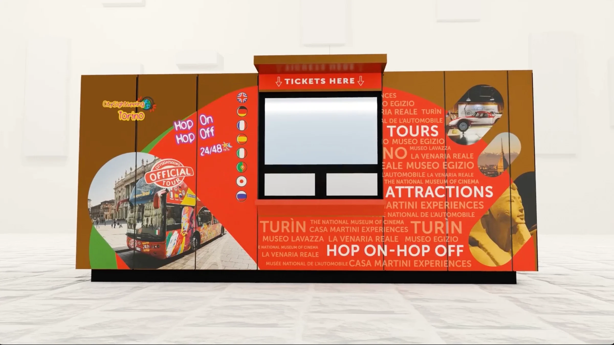
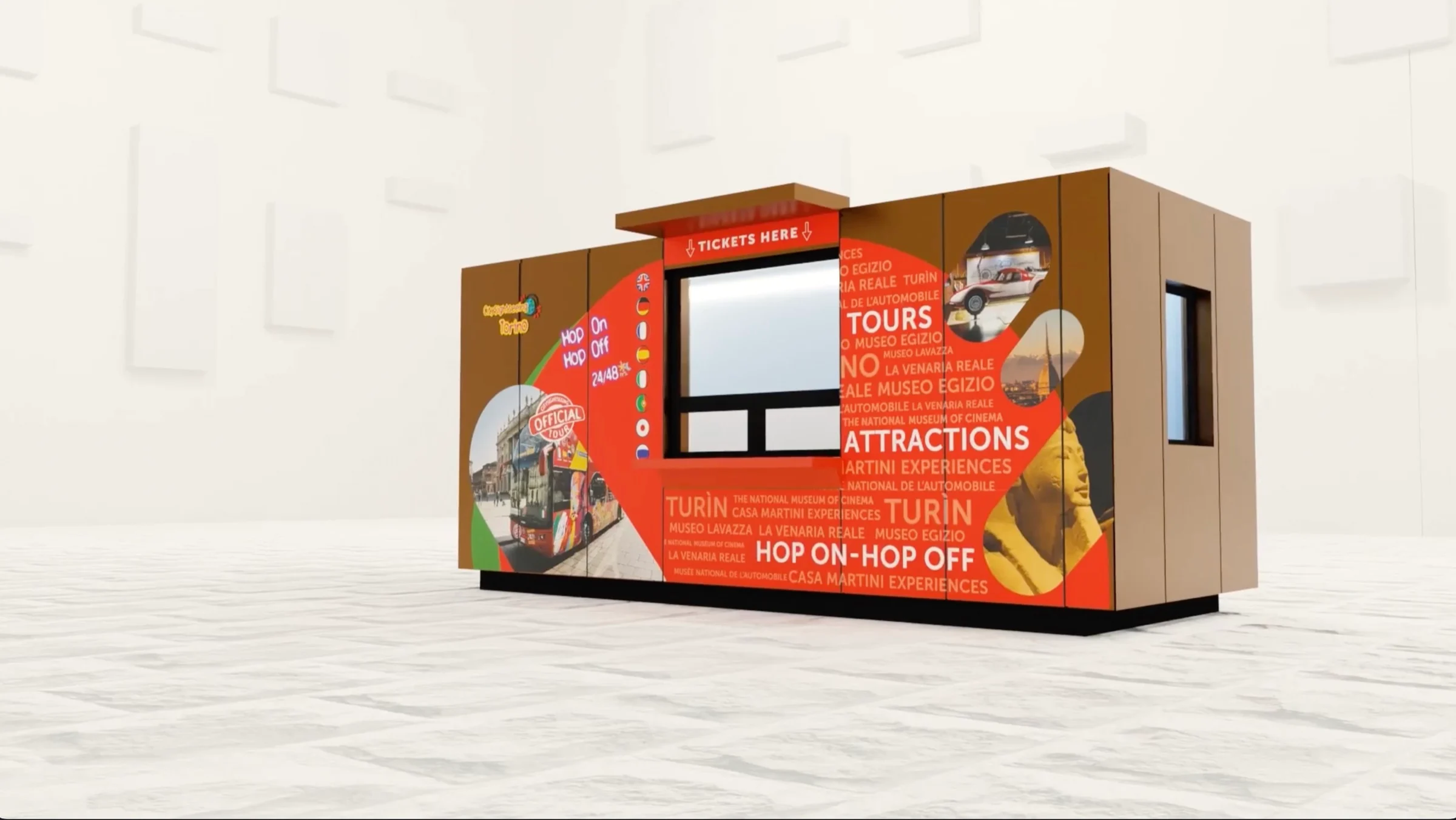
Render of the Turin infopoint, a wooden kiosk wrapped in red graphics reading Tours, Attractions and Hop on–hop off

From 2021 to 2023, with my studio, I ran City Sightseeing’s brand communication in Italy: every city, every brochure, and three infopoints.

Florence, Milan, Turin, Rome, Naples, Capri, Bologna, Livorno and more: the red double-deckers run across Italy, and every city sells its own mix of bus tours, excursions and attractions to visitors from all over the world. With Mallet Studio I looked after the communication of every location, from the printed leaflets to the places where tickets are sold.

One voice in every city

Leaflets, maps and price lists share one language: a big photograph for every experience, its price in plain sight, the languages it runs in, and the same red in every city.
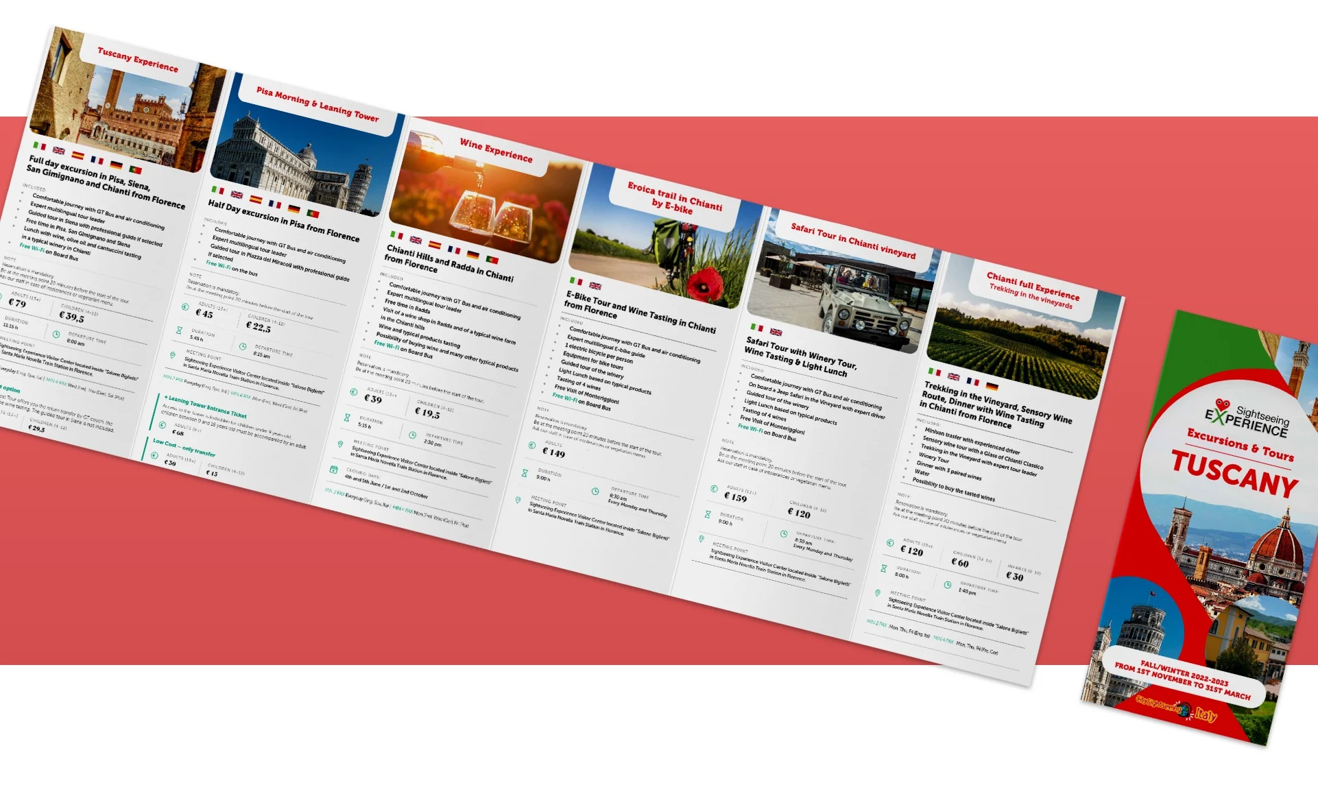
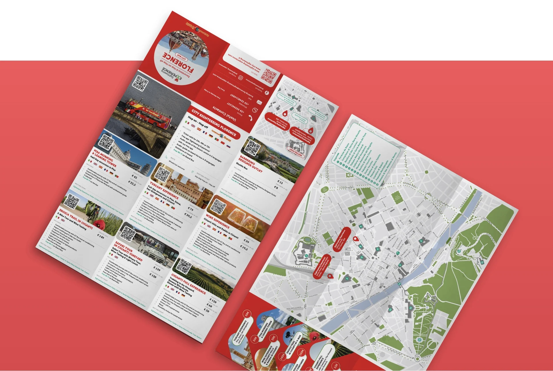
A folded leaflet of excursions and tours in Tuscany, each panel with a photo, a short description and prices
Excursions and tours in Tuscany, one panel each.
The Florence leaflet: tours with QR codes on one side, a map of the city on the other
Florence: the tours on one side, the map on the other.
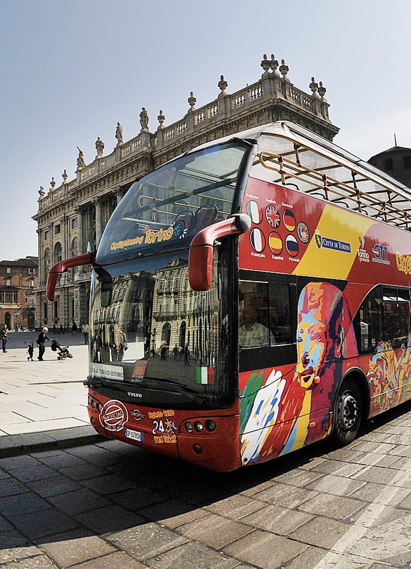
A red City Sightseeing double-decker bus in a square in Turin
The buses carry the same red.
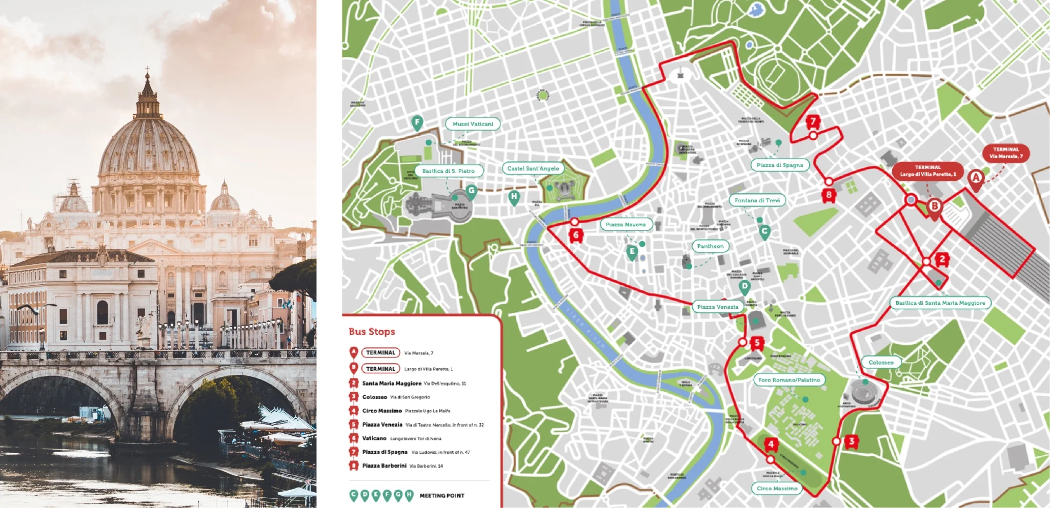
Rome leaflet: a photograph of St Peter’s beside a map of the bus route with numbered stops
Rome: the route and every stop on one map.
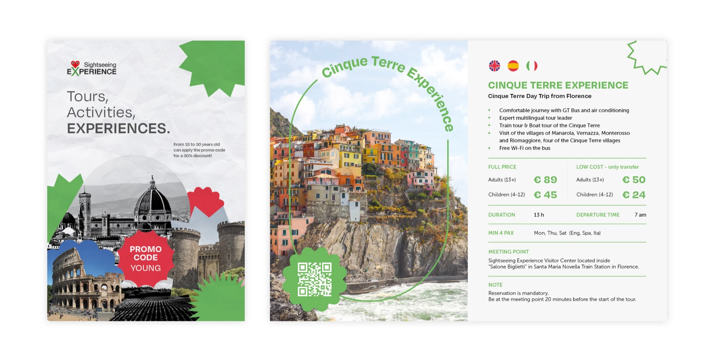
A leaflet for young travellers with a Promo code Young sticker, and a Cinque Terre Experience page with prices and a QR code
A line for travellers from 18 to 30, with its own promo code.

Infopoints you can read from the street

Three infopoints, designed and rendered in 3D before they were built: a shop on Via Cavour in Florence, a visitor centre in the ticket hall of Florence’s main station, and a kiosk in Turin. Each one tells you what is on sale and how much it costs before you even walk in.
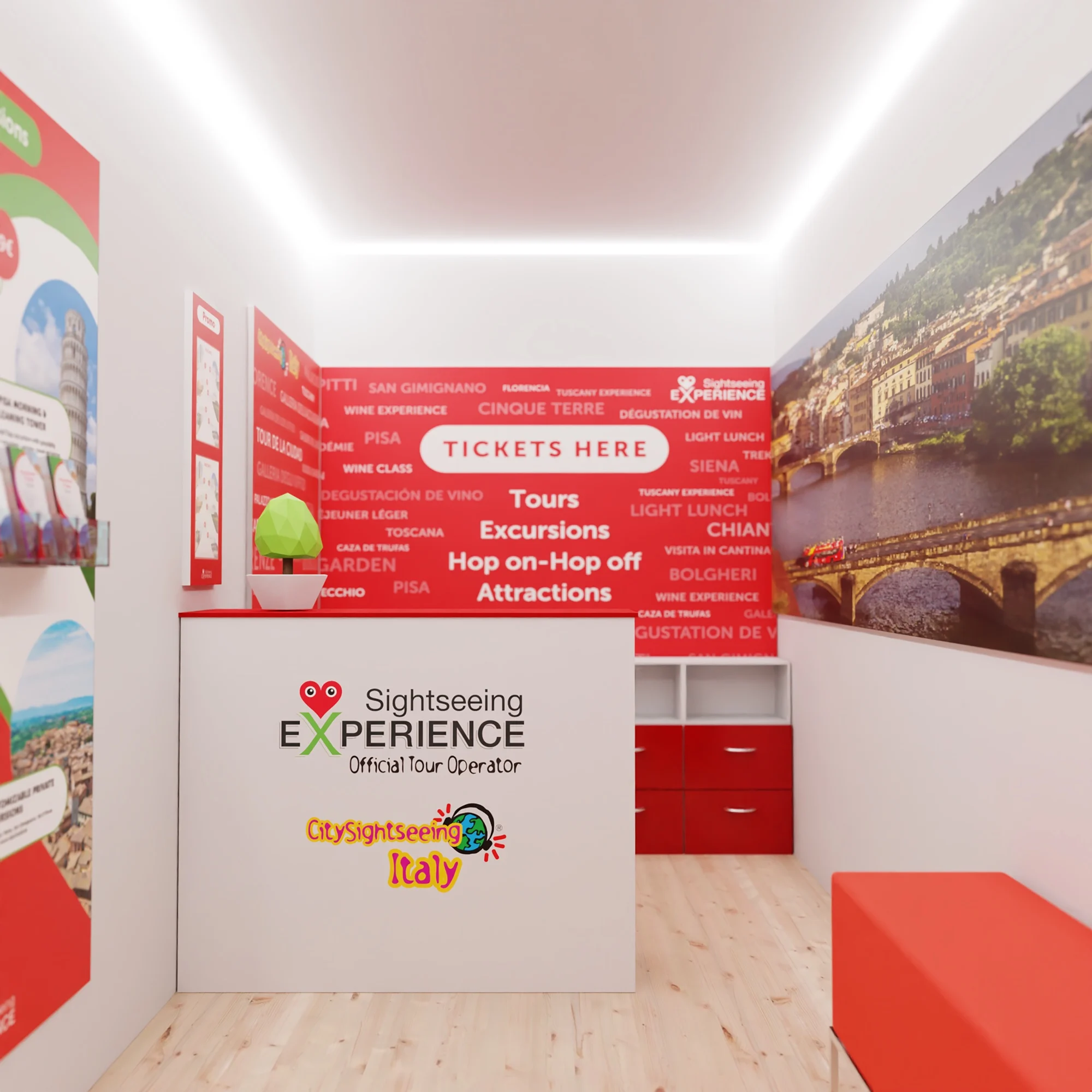
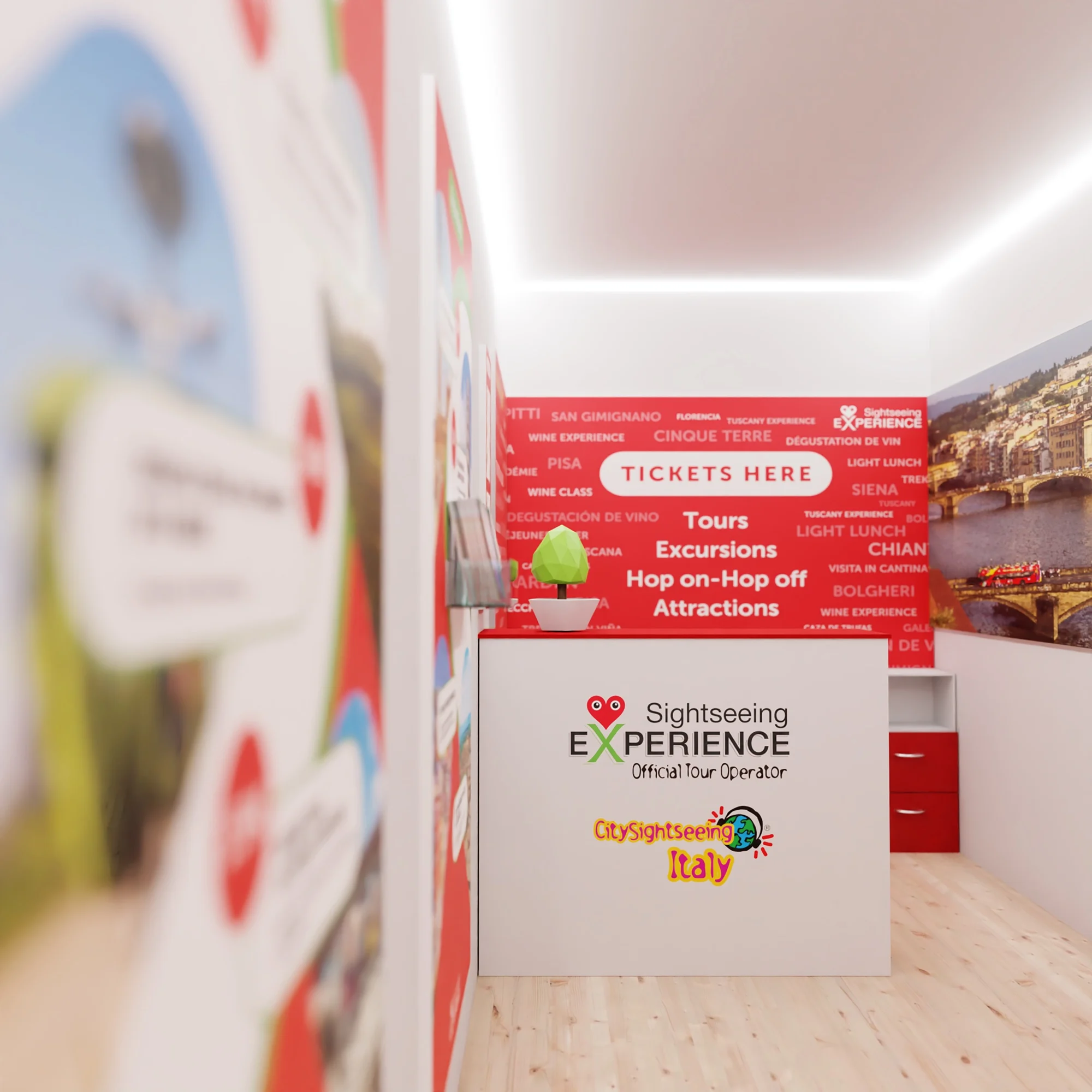
Via Cavour, Florence: the door is the sign.
Render of the Via Cavour interior: a white desk with the Sightseeing Experience logo in front of a red wall reading Tickets here
The desk, at the end of the room.
Render of the Via Cavour room seen from the side, with tour panels and a red bench
Tours on one wall, Florence on the other.
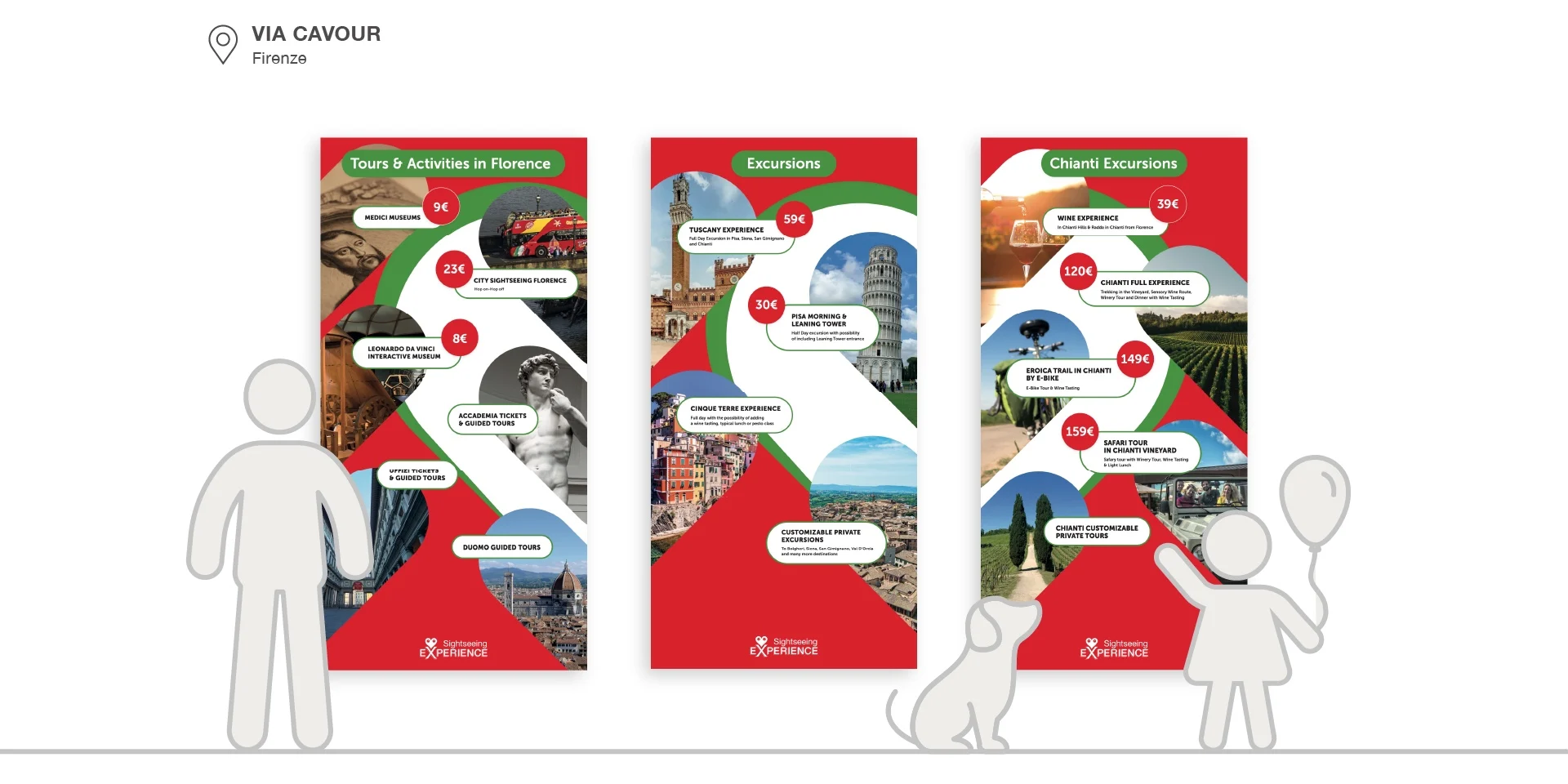
Three tall panels for Via Cavour: tours and activities in Florence, excursions, and Chianti excursions, each with prices in red circles
The wall panels: tours, excursions and Chianti, priced at a glance.
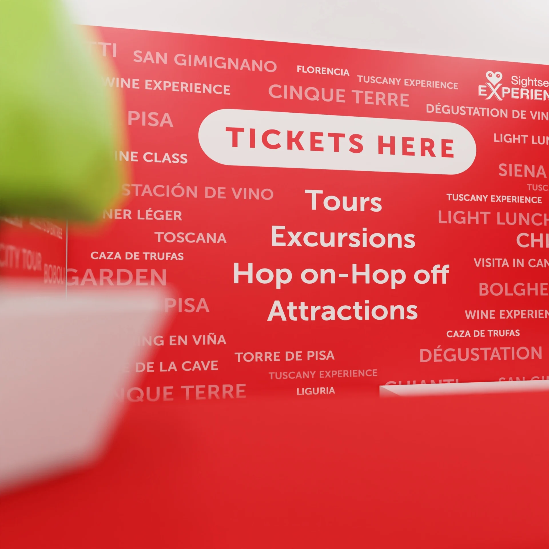
Close-up render of a red wall covered in destination names behind the words Tickets here, Tours, Excursions, Hop on–hop off, Attractions
Every destination, written on the wall.
The visitor centre in the ticket hall of Florence’s main station.
Turin: a kiosk you can read from every side.
Render of the Turin kiosk from the front, with the ticket window at the centre
The ticket window, in the middle of the offer.

Outcome

All three infopoints were built and are open today. I have no sales figures. What I know is that the management and every member of staff we asked valued how clear and easy to use the materials were: they made the offer much easier to explain to tourists.

Let’s talk.

Open to senior product and design roles.